Growth of a Twitter graph
Twitter connections change over time. We tend to follow more people as we go, but we also remove connections depending our interest and attention span. At least I do. Since I look at the whole network activity from a very thin slice (a list) I prefer to cure my network, I remove some people to be able to keep up with others.
I decided to look at what kind of interest groups emerge as I cure my Twitter social graph. Do my Twitter friends have always growing interconnections? How do people relate? Do I have friends who link together otherwise disconnected communities of interest? Do my Twitter clusters expand or contract over time?
Like the Amazon book network research I did earlier, I was inspired by Valdis Krebs’s network analysis research. Particularly in his recent post, Krebs did an analysis of his Twitter map, where he compared a low-res information visualization work TwitterWheel, with his diagram created in InFlow network analysis software. InFlow diagram is simple but rich, you understand more at a glance. Whereas TwitterWheel stands as a good example of info-viz-kitsch.
I used the graph layout program I developed earlier for the Amazon book network research. But this time no manual data collection, I grabbed all the friends data from the Twitter API. I collected my friends data at three different times to be able to compare the diagrams in time. Click on the images below to enlarge.
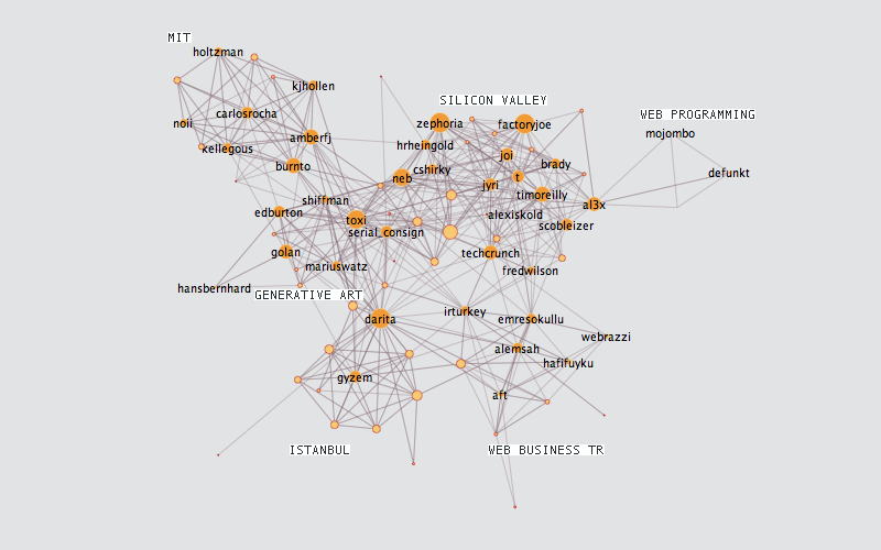
My Twitter Graph Week 1
Three weeks ago I was following 80 people. Laying out only the interconnections within the friends (removing my self), we see 6 clusters. By looking at the people I know here, I label them as “MIT”, “silicon valley”, “web programming”, “generative art”, “Istanbul”, and “web business tr (Turkey)”. The silicon valley cluster is large and dense compared to others. The MIT cluster is almost like a clique (every person connected to every other). Generative art is quite close to Silicon Valley, mostly bridged through the user neb. Obviously the Turkish web business cluster has many connections to the Silicon Valley, techcrunch being a major bridge here. The web programming cluster is very small, surprisingly it is connected to Silicon Valley only through the user al3x, who works at Twitter. After this first diagram, I decided to weave more web programmers, generative artists, and people I know from Istanbul. Also I removed neb, al3x, Scobleizer, TechCrunch to have less Silicon Valley weather news.
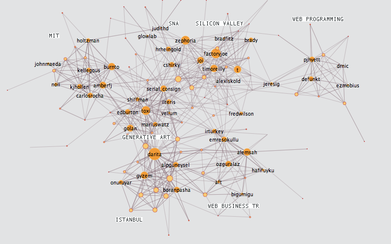
My Twitter Graph Week 2
Second week, I follow 118 people and the diagram is more hairy. Generative art, web programming, and the MIT clusters are now larger. Istanbul intensifies because of the growing interconnections and it pulls the web business tr after it lost a few Silicon Valley bridges. Now Silicon Valley has a little child called SNA (Social Network Analysis), a separate cluster emerged after I started to follow judithd. Also jeresig between web programming and Silicon Valley, and darita between generative art and Istanbul emerge as major bridges. After the second diagram I decided to weave more people from the field of network analysis, and decided to find more “net art” people.
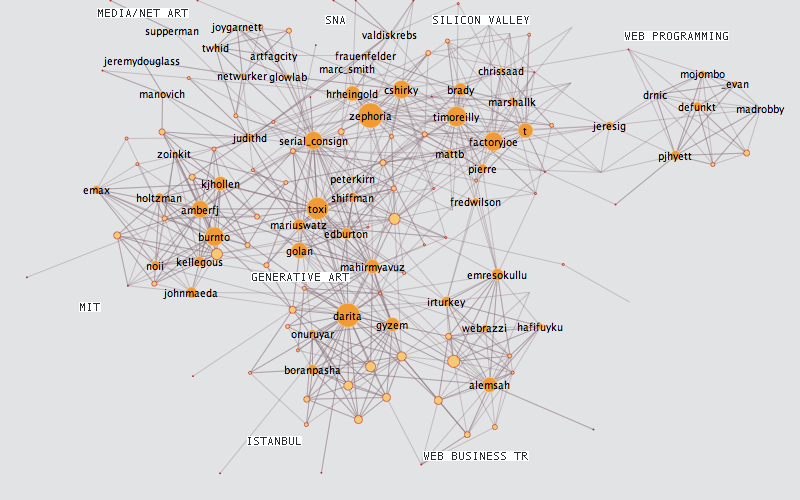
My Twitter Graph Week 3
Third week, I follow 158 people, more bridges, more dense clusters. The new SNA cluster becomes larger, zephoria being at the center, and stands slightly away from Silicon Valley. A new cluster emerges on the top left, I call it “media/net art”. It is loosely interconnected, and the major magnets weaving the network are manovich, twhid, netwurker, and artfagcity. Media/net art cluster emerged from the extensions of MIT, Silicon Valley, and generative art. Also now between MIT, generative art, and Istanbul there are more bridges, and they are getting closer. toxi keeps his position at the center of the generative art. Interestingly serial_consign emerged as a major bridge between generative art and the new “media/net art” clusters. Silicon Valley and generative art are more away from each other.
Here is a movie showing the force-directed-graph layout program and me interacting to find who is who. Sorry for the crappy compression of Vimeo.
My Twitter Graph Week 3 from arikan on Vimeo.
Over the three weeks I intentionally separated strategic bridges to the Silicon Valley cluster. I was curious. The is why do generative art, SNA, and media/net art clusters are highly pulled by the Silicon Valley? Another , a meta is, do these people mind about what these diagrams reveal about their privacy, while all the data is public?
Of course these clusters are my interpretation, they can be more crsytallized, more generalized, or named differently. Networks as static structures do not tell us much and never reflect the reality, however networks as systems evolving over time is quite helpful to understand the dynamics of living systems. Overall these diagrams help me cure my Twitter network better.
View more posts in the Blog Archive.


